

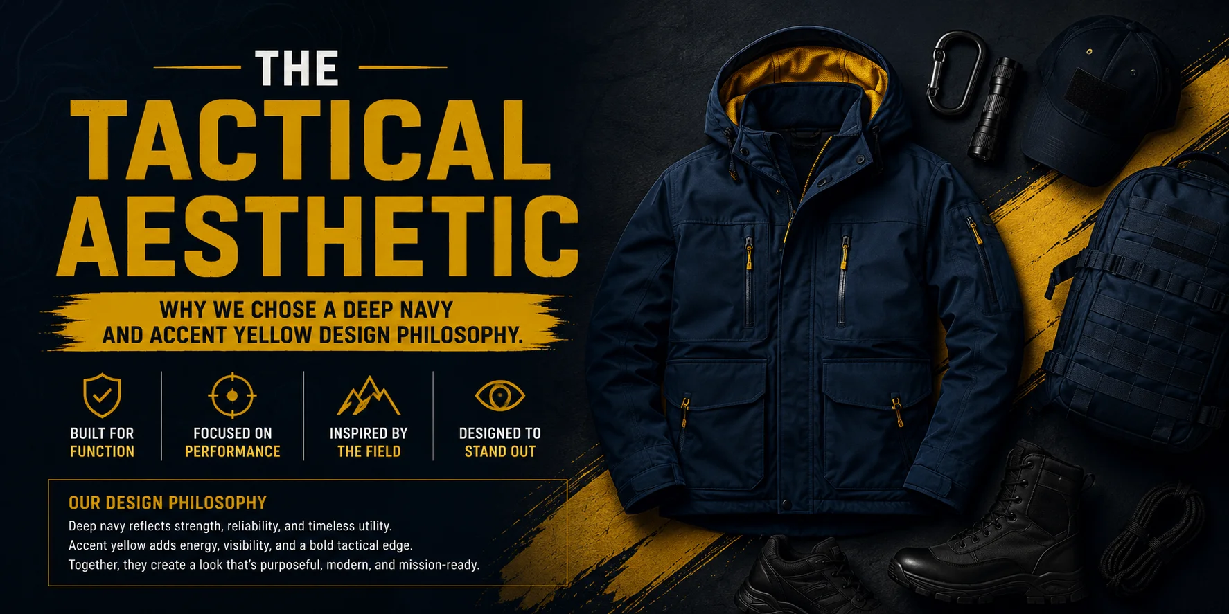
The Tactical Aesthetic: Why we chose a deep navy and accent red design philosophy.
The design philosophy of the Pava Army Store is built upon a tactical dark aesthetic that reflects a premium, bold, and masculine identity. Our choice of a specific color palette is intentional, aimed at capturing the high-performance spirit of the “outdoor enthusiast”.
1. The Core: Primary Dark (#1A1A2E)
We chose Deep Navy/Black as our base to establish a “Dark Mode” foundation.
- Tactical Stealth: This deep shade provides a professional, utility-focused look that resonates with military and tactical gear.
- Premium Contrast: A dark background allows high-quality product imagery and bold typography to stand out with a “premium feel”.
- Practicality: Much like the gear we sell, this base color is rugged and timeless, designed to look as good in the wilderness as it does in the city.
2. The Energy: Accent Red (#E94560)
The use of Accent Red serves as a high-contrast element against our Primary Dark base.
- Visual Hierarchy: Red is used to draw immediate attention to critical “Call to Action” (CTA) buttons like SHOP NOW or BUY NOW.
- Urgency and Action: This color choice reflects the high-energy nature of adventure seeking and trekking.
- Modern Edge: Combined with our navy base, the red accent creates a modern, D2C fashion look that distinguishes Pava Army from generic outdoor brands.
3. The Supporting Tones: Light BG & White
To ensure the store remains readable and doesn’t feel “bloated” or heavy, we integrate Light BG (#F4F6FB) and White (#FFFFFF).
- Clean Whitespace: These colors provide necessary “breathing room,” ensuring a clean and high-converting user interface.
- Typography Support: They offer maximum legibility for our body fonts (Inter/DM Sans), while our bold headings (Oswald/Bebas Neue) maintain their tactical impact.
By sticking to this Deep Navy and Accent Red philosophy, we ensure that every interaction—from the announcement bar to the product swatches—feels like a cohesive part of the Pava Army mission.

